
Federico PeyraniFrontend Engineer - ContentWise

Selene MalossoFrontend Engineer - Akamas
It's been almost two months since Spindle was first announced and it is saddening to know that have been no updates on the project ever since. We had a lot of new features planned, but we got caught up in other projects and had to take a hiatus from working on them. Now we're finally out of the woods with that, so before August slips away it's time to officially announce our latest release: Spindle 23.08!
What's new
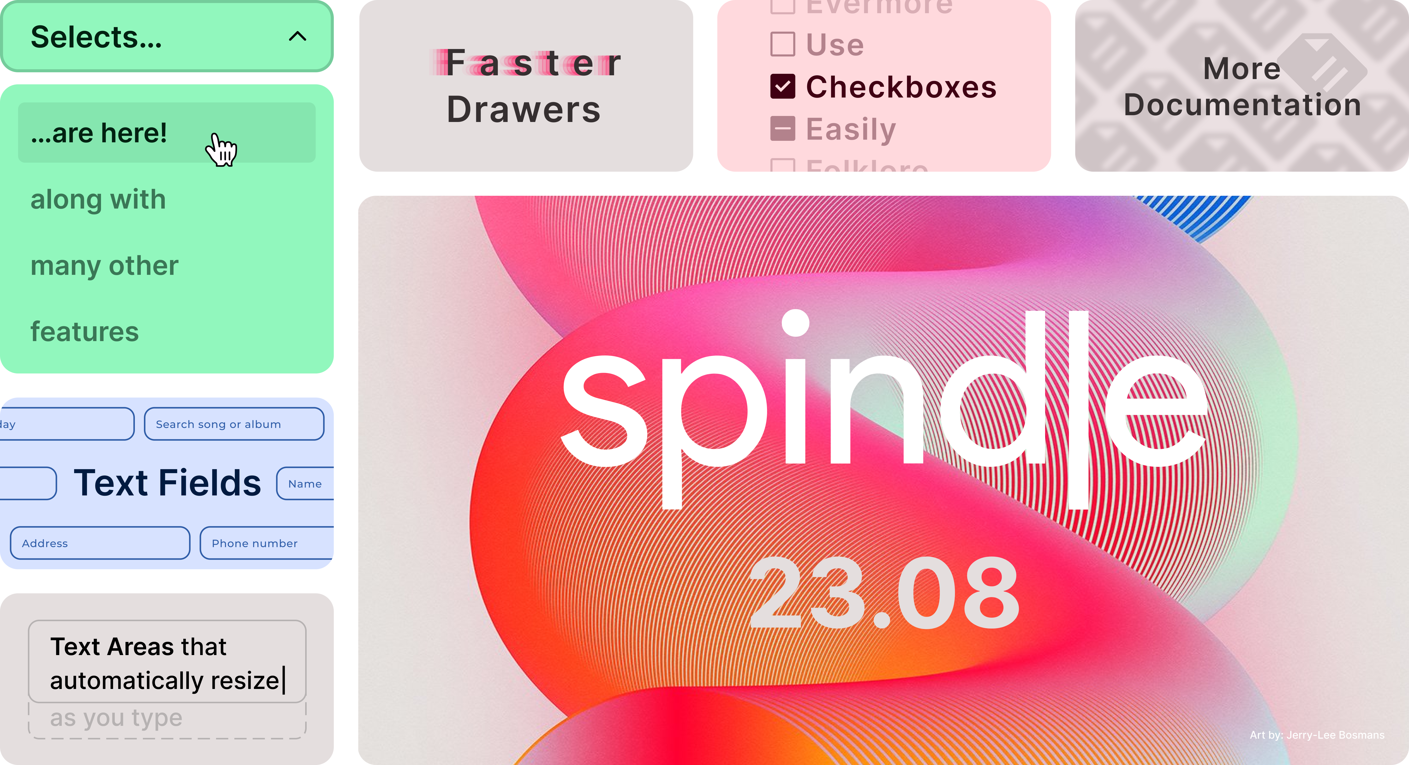
We are working on expanding the number of components included in the base package and we have plans to keep doing that so that Spindle can become the all-in-one solution for all your UI needs. This time, we're bringing the first batch of form controls to Moviri developers, which includes the Select component, both the TextField and TextArea component to manage text inputs and the Checkbox. We have decided to start with what can be considered "essentials" for enterprise applications and focus in particular on those components that you'd expect to see when filling out a form and you can expect more in the future (we make heavy use of them here, don't blame me, if you're not then you're not doing it right). Under the hood, you'll also find some minor adjustments and overall improvements, but I'll leave the boring details in the changelog below.autosize lets it automatically resize to wrap the text inside it,
no matter its length (the generated responses from those large language models everyone keeps talking about will feel
right at home with it).
What's coming next
As anticipated, you can expect a new wave of components for your forms soon in an effort to make Spindle as comprehensive as possible for the web applications we at Moviri are used to seeing. We have already laid out the details and I am glad to say that they are already being actively worked on. But new stuff doesn't stop there! Look forward to meeting other components as well, new customisation options, stylistic flavours and quality-of-life improvements geared towards the development experience, which we know all too well to be otherwise frustrating at times. We're also gradually bringing improvements to already introduced components as Spindle is starting to seep more into our applications and new possibilities for improvement are sprouting. That's that for Spindle 23.08! You can check out the getting started guide if you need to spin it out for the first time or update to the latest version of@moviri/spindle-components to test out the new features, or
head to the components documentation if want to learn more on how to use them.
See you in the future,Federico.
Full changelog
| Package | Old version | New version |
|---|---|---|
@moviri/spindle-components | 0.2.0 | 0.3.0 |
@moviri/spindle-theme | 0.1.0 | 0.1.1 |
Added:
-
Selectcomponent. -
TextFieldcomponent. -
TextAreacomponent. -
Checkboxcomponent.
Changed:
- Changed how the rendering of the
Drawercomponent is handled: now the component is automatically mounted on the first render ifisOpenis true, which will cause an exception if attempting to render it as open on the server. Conversely, ifisOpenis set to false, the component will delay its rendering until its state changes. This allows us to skip the re-render on the client during hydration which was kept to allow server-side rendering to coexist with the client-side without extra configurations needed. - Property
typeof button now defaults tobuttoninstead, the variant (primary,secondaryortext) is now specified by setting thevariantname astrueinstead. - The
Drawercomponent now makes use ofreact-aria.
Fixed:
- Enabled Typescript's strict mode in
@moviri/spindle-componentswhich was previously disabled. - Improved the stability of nested drawers. Now drawers can be also be closed out of order, and not necessarily from the one that is on top.
- The close icon of the
Drawercomponent now fades in and out when the drawer is opened or closed, instead of appearing and disappearing abruptly.