
Federico PeyraniFrontend Engineer - ContentWise

Selene MalossoFrontend Engineer - Akamas
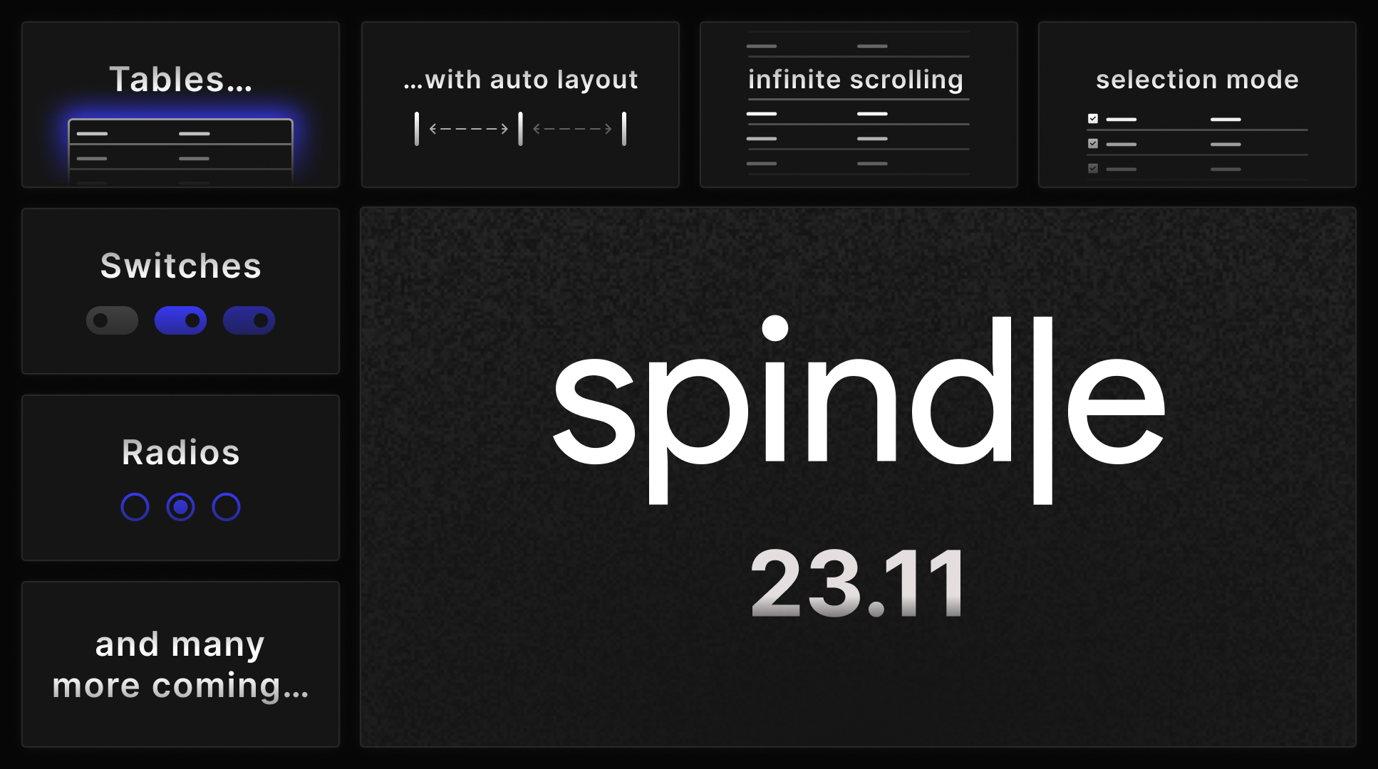
The crisp embrace of the chilly season is upon us, and it's that exciting time again when we unveil the latest Spindle release, brimming with all-new components to satiate your UI desires. As we have anticipated, one of our plans is to build a comprehensive suite of form controls, and it's time for the Radio and Switch components to hog the spotlight this time around. But the crown jewel of this release is the long-anticipated Table component, our most ambitious endeavour yet, evermore present in nothing but our wildest dreams since the very beginning. But let us unpack the details one by one:
Now, let's talk about the Switch, the cooler sibling of the checkbox component. Although they serve much the same
purpose and you can use them interchangeably at your heart's content (we won't judge your favouritism), it is best
suited when the option you are providing reflects an "on-off" status.
Name | Type | Level | |
|---|---|---|---|
Charizard | Fire, Flying | 67 | |
Blastoise | Water | 56 | |
Venusaur | Grass, Poison | 83 | |
Pikachu | Electric | 100 |
Federico.
Full changelog:
@moviri/spindle-components
0.4.0
Minor Changes
- Created
TableandTableViewcomponent.
Patch Changes
- Added styled focus ring to certain components (currently includes Button, Checkbox, Radio).
- Fixed an alignment issue with the icons inside the
TextFieldcomponent. - Created
Switchcomponent. - Split
react-ariaandreact-statelyinto its individual dependencies. This avoids installing all the packages required byreact-ariaandreact-statelywhen using this package. - Added
childrenprop to Checkbox to suppress missingaria-labelwarning. - Added global style resets, such as html/body dimensions, text selection colors and a custom scrollbar.
- Added the "use client" to the generated source files to support the Next.js app directory.
- Fixed a bug with react-aria when using the useModalOverlay hook caused by ariaHideOutside receiving a null reference when first rendering the component on the client (since the component is not rendered on the server).
- Created Radio component.
- Updated dependencies [fa3e257]:
-
@moviri/spindle-theme@0.1.2
@moviri/spindle-theme
0.1.2
Patch Changes
- Added experimental support for parsing tokens defined in
.sassfiles.